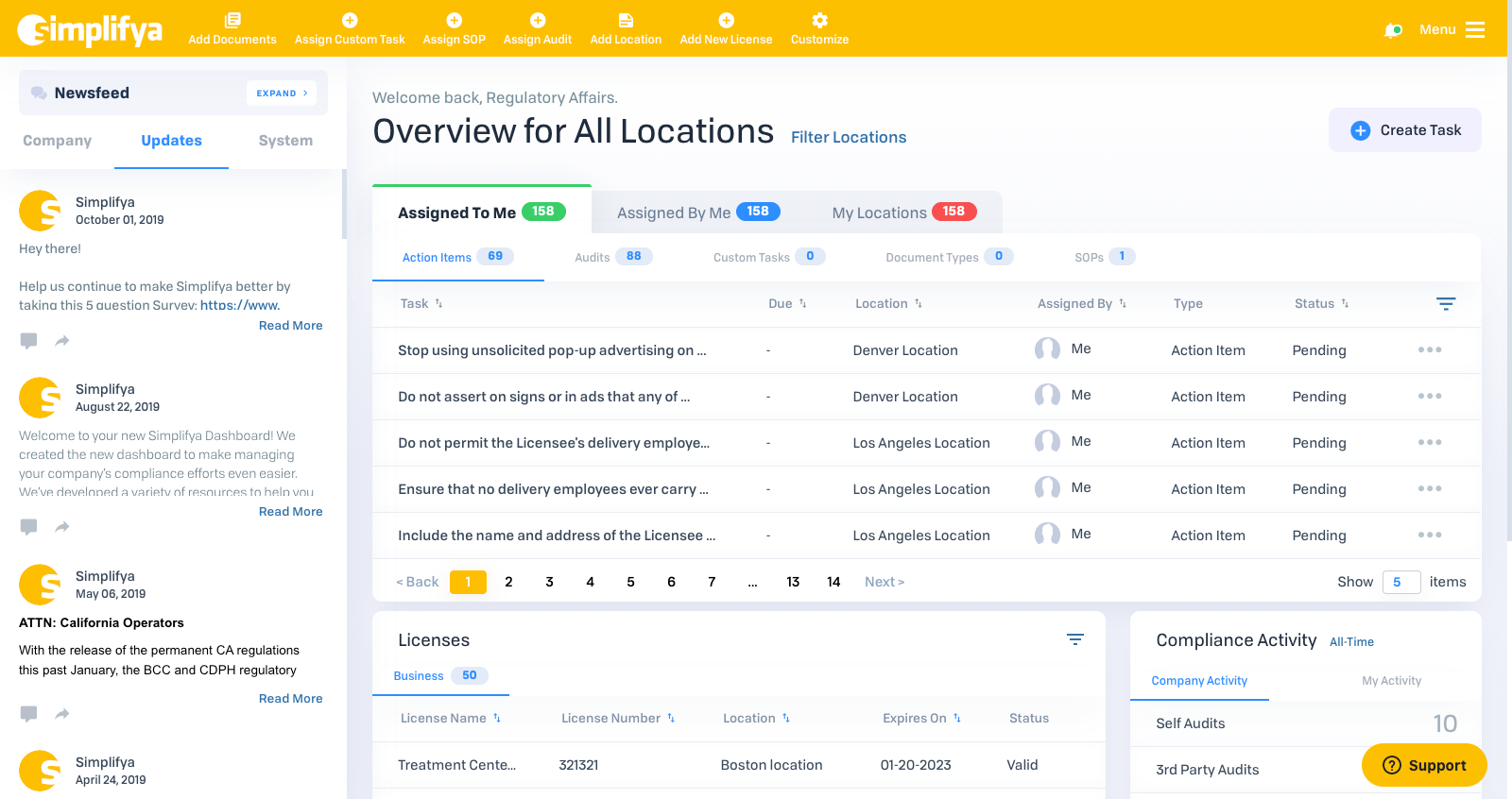
We’re now just weeks away from the release of our new dashboard! It’s the result of almost a gritty year of research, user validation, and even some breaks in development. But we’re here, and we on the product team are staunch believers we’re releasing something amazing, and that the new dashboard will be an undeniable improvement for our users.
For those close to the process, it hasn’t come without moments of frustration. Twelve months is a long time, and it’s only made more perplexing by some fundamental divergence from how we’ve built and released features in the past (see the next section).
And with that, I wanted to open a window into the process of building the dashboard over the last 12 months, and how it sets the stage for us to level up our product development and feature release process.
For Starters, We Thought About it Differently
By and large, Simplifya’s features have been rolled out in slower, incremental fashion. This was the case for SOPs, Oversight Portal, and most of Smart Cabinet. There’s merit to this approach. We’ve made it work and we’ve gotten better at it. But…
It wasn’t the best approach for the dashboard, and we decided to buck that trend. With the dashboard, our goal was to release a polished iteration that goes far beyond an MVP. Something that (outside of a small tweak or two), won’t need to be revisited for some time.
The biggest reason for this is a simple one: Users hate change. The dashboard is the landing spot of every login, and therefore the most utilized page in the app. We didn’t want to make a semi-drastic change, and then, as people got comfortable, change it some more.
I think the unique thing about the dashboard is it’s more about improving the user experience, less about introducing a new feature. So where we normally try to use client feedback to inform feature development (e.g., I need to be able choose which questions are in an audit), this is a case where we as a product team were providing feedback to a UX expert about how the user experience needed to improve. Features are more tangible, experience is more intangible.
We Spent More Time on “Product” Work
I’m not shy to admit we did a lot more traditional product work as we conceived, built and tested the dashboard. Not only is this effectively the first major release since Watson came on (whose impact on this is readily visible), but we took some measures that we hadn’t before, including:
Contracting a UX designer
Circa fall of last year, we started the dashboard work by engaging a freelance UX designer. After a couple iterations, he ultimately delivered designs (including some CSS/HTML code). But over the course of a couple of months he helped us ask some key questions about what the dashboard needed to do.
Having more frequent user discussions (and earlier)
In the early going, it was discussion with Jordan and Sarah, getting initial thoughts, uncovering gaps in functionality, and even debating taxonomy. In recent months, we’ve shown it to marketing and sales. We’ve discussed value props, looked at use cases for our different client types, and even had an “Oh, sh*t” moment where identified an opportunity we were missing with MSOs (shout out to Brooke).
Holding an internal beta period
I write this as we start our beta period, but for the first time, we’re going to have an internal user group. This gives us a chance to step back and have discussion about the dashboard, not only as we talk about value props, but as a chance for our more casual users to tell us what they see.
Speaking of Watson…
The hands-on everything, data gathering nature of the Product Manager role doesn’t always make it easy to call out singular accomplishments. But this is one of those times where we can. From the product work above to the release activities below, Watson has been the point person of all things Dashboard release. Over the last few months, he’s played the roles of project manager, analyst, facilitator, trainer, and demo jockey. All in the name of making sure 1) we build a feature that’s as useful as it is impressive and 2) we communicate it in a way that resonates with our clients.
We Built a Product Release Template
In the latter stages of development, we constructed a release plan that looped in numerous other departments as we outline and account for all the aspects of successfully communicating this new feature.

To categorize this plan as “cross-departmental” would be an understatement. From Sales to Marketing to Regulatory Affairs, it’s fair to say everyone in the company will have a part in making this a reality. In all, the plan included:
- Foundational value prop documents and talking points
- An instructional dashboard video
- ZenDesk Help Center articles
- External client communications and other marketing collateral
- Company-wide internal beta testing period
And We’re Better Off in the Long Run
The best part of all of the above? We’ve done it once, and we can do it again.
From the product due diligence to the communications plan, we’re paving new roads for how we handle future releases. It’s a giant step in forming the muscle memory for how Simplifya works towards large new feature releases.
So while we’re still a few weeks away from a good pat on the back, it’s a good time to call out this exciting moment in Simplifya’s development.
Thanks for sharing the behind-the-scenes thought and work, Dave! I’m obviously biased from my early work on this project, but I’m excited that this design incorporates more modern UX principles. Specifically, maximizing the utility of the “home” page, the use of color to communicate functionality in addition to style, appropriate use of tabs, badges that show counts, sorting arrows (FINALLY), appropriate font sizes and colors, quick links to common actions, and even a hamburger menu! This is a huge leap forward in usability and I thank you (and Watson) for taking the time to do this in a way that future releases will benefit.